Few things clarify a story in data than a chart. Charts are everywhere, with a fair share of good charts, and bad. But what makes a good chart stand apart from a bad one?
Here are 5 ways to make your charts better right now. These are easy steps to make your visuals more effective and help readers better understand your data. Though these principles work for anyone, I create this list with researchers, academics, and other non-designers in mind.
The charts here were created using Microsoft Excel, a super effective tool nearly everyone of us have used. However, these concepts are not software-exclusive. You can easily apply these methods to charts created in Google Sheets, Apple Sheets, PowerPoint, Adobe Illustrator, etc.
Watch the Video
Make your titles meaningful
Every dataset and chart has its own story. Using your chart title to detail this story is a very effective method of guiding readers to better understanding this story.
Titles and subtitles can also add context to your data. This is a great way to also have your chart and your narrative or text, say in a report, work together to tell meaningful and accurate stories about your data.
I like to use both titles and subtitles to add context and guide readers in understanding what your data are saying and the key takeaway of your chart. I learned this method from an excellent book written for journalists using data graphics.
Writing a good title
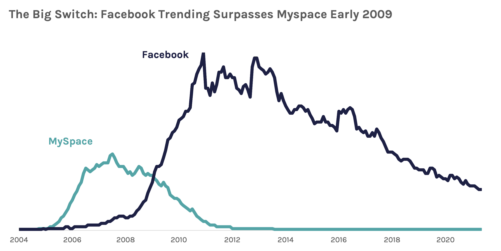
Use your title to detail the key takeaway of your chart. If your chart is the story, your title is the headline, like a newspaper article. Keep it short, snappy, and accurate. For example:
Oil Prices Climb Since 2005
Women are Exiting the Workforce Faster than Men
More than 35,000 Sheep are Eaten Every Year
This way, you are telling your readers what the chart is saying, whether they read the title or look at the chart first. Make your title larger and/or in a heavy weight font, right at the top of your chart.
Using Subtitles to Add Context
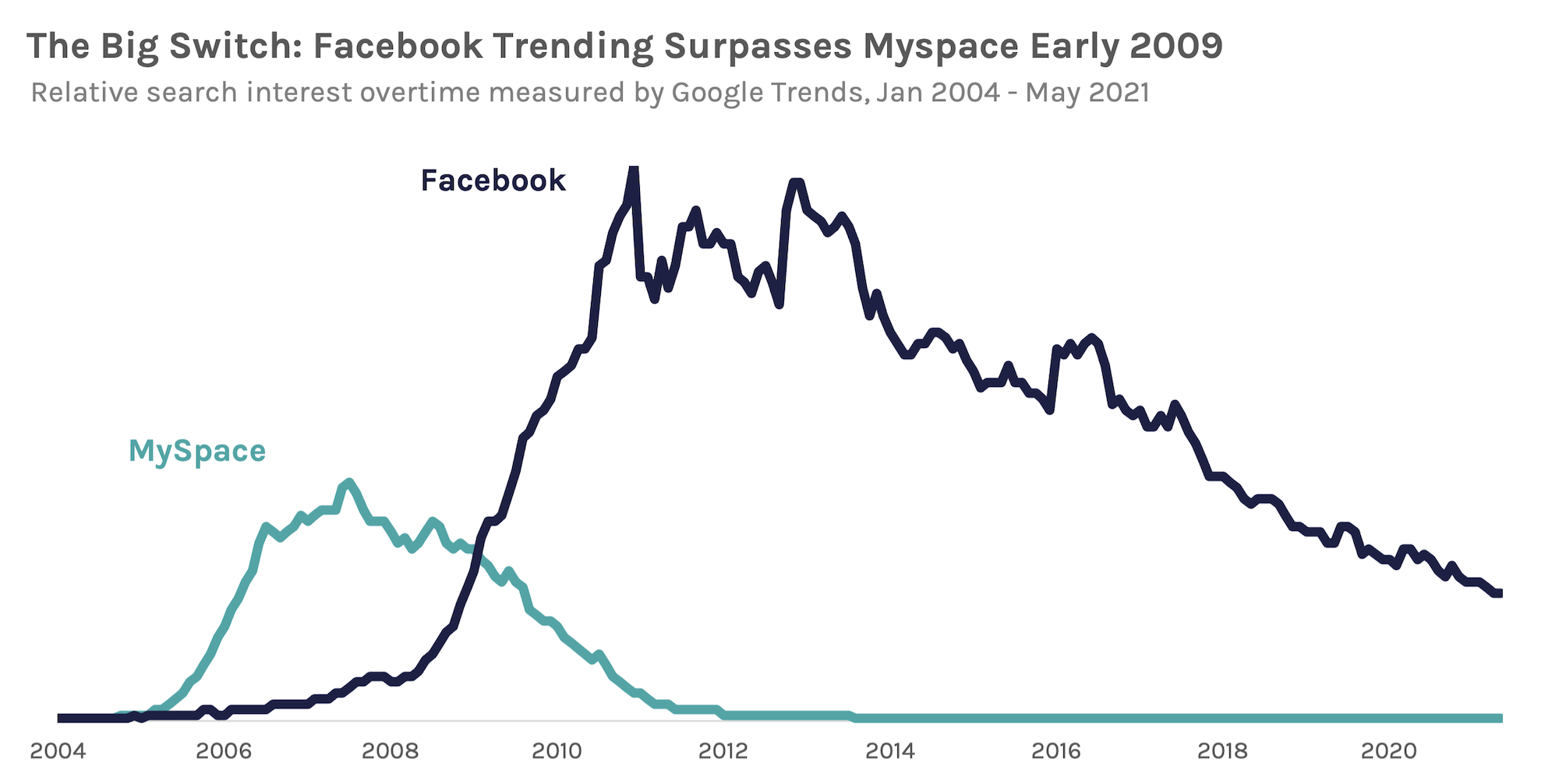
Once you have a title with a key takeaway, its important readers understand the details of the data that’s essentially to understanding its meaning. A chart with a bunch of numbers and no context is not only useless, but leaves a grey area for readers to possibly interpret the data inaccurately.
While I use the title to tell readers what the chart means, I use subtitles to detail what the data are. For example:
Percent of women 18-35 years old who said they smoke, 2000 to 2020
Total sales of Honda Civics in the United States, 1990 to 2000, 2020 $USD
Number of Christmas trees purchased in Michigan by income, 2020
I think it’s important to put these details right at the top of the chart so that it’s easy for readers to find and reference as they explore the chart. Also, including these details more prominently than say a note conveys importance to the reader, helping build trust about your data.
Don’t forget notes and sources
Another key use of text with a chart is including notes and sources, right on your chart. One major task as a chart creator is building trust in your data. By having further details and source information right on your chart, you help your reader understand more context and be informed of your source while reading your chart.
I use the chart footer for notes and sources, including as many details necessary to give additional context, explain weird things about the data, and expand the subtitle if necessary. For example, you can use notes to explain skipped years in trends, definitions of categories used in your data, etc.
I also include a source with as much information as needed to make it easy for readers to know where they can find the data in the chart. This could be a reference to a table in your appendix, a major government agency, the name of another publication, a reference to a source in your bibliography, etc.
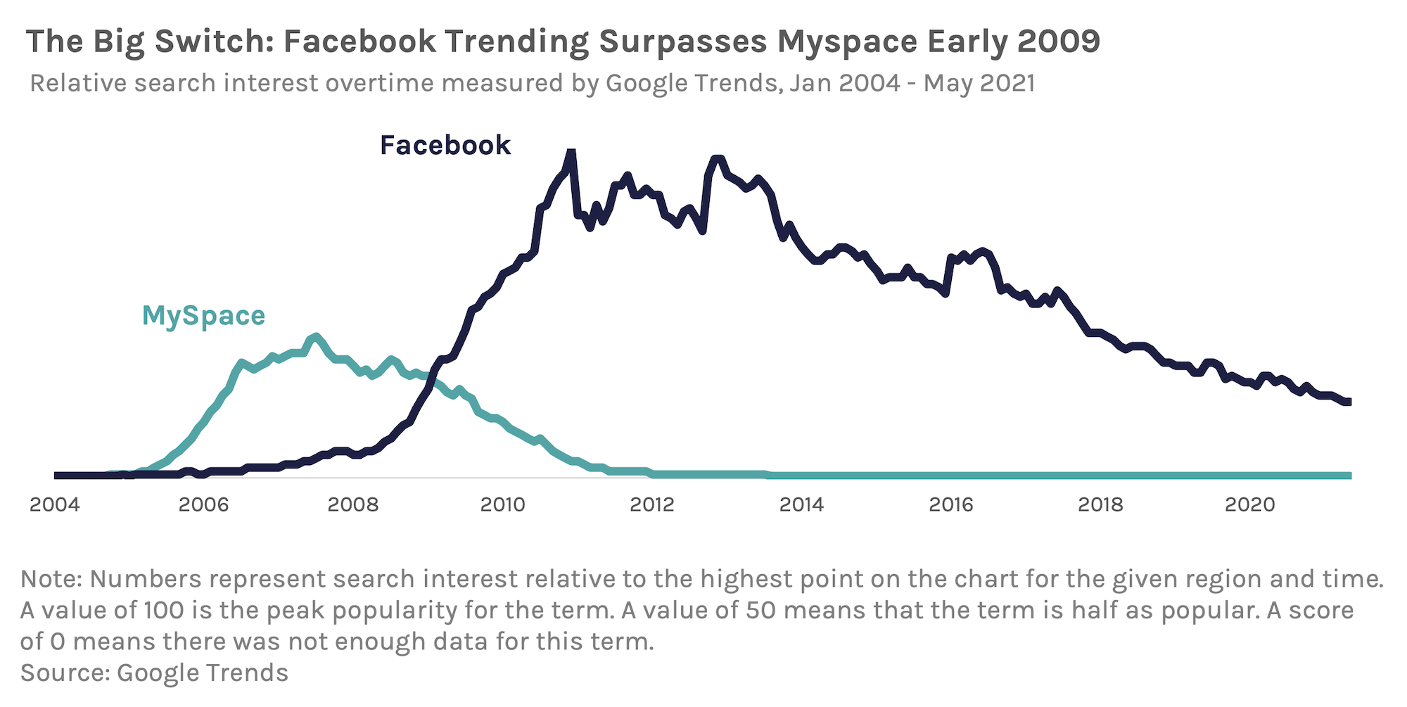
A rule of thumb I use: you may not need to include notes, but always include a source. You can format your notes and sources in many ways. You can include the words “notes” and “source” or simply put them in a different, smaller text at the bottom of your chart.
Here are some examples:
NOTE: Data was not available for 1999 due to funding shortage.
Prior to 1967, women were not asked their race/ethnicity in this survey.Data from 1967 and before include those who told researchers their race or ethnicity was “white.”
Note: Data in 2021 dollars, adjusted for inflation.
SOURCE: CDC
Original analysis of WHO’s annual report on Education
Source: See Appendix D, Table 2
Clean-up the noise
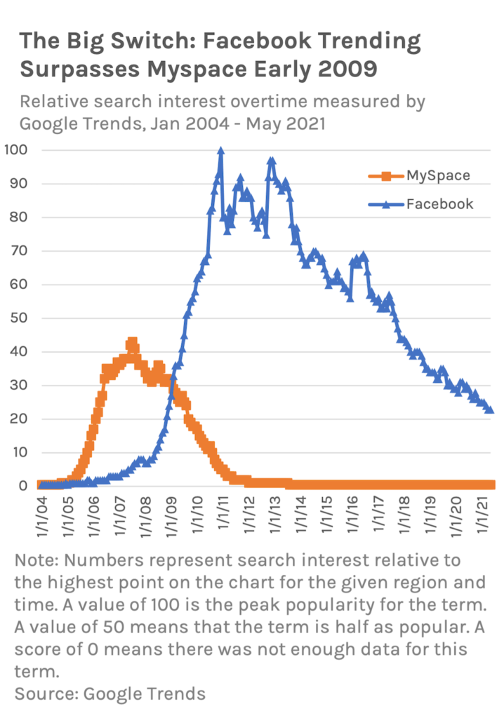
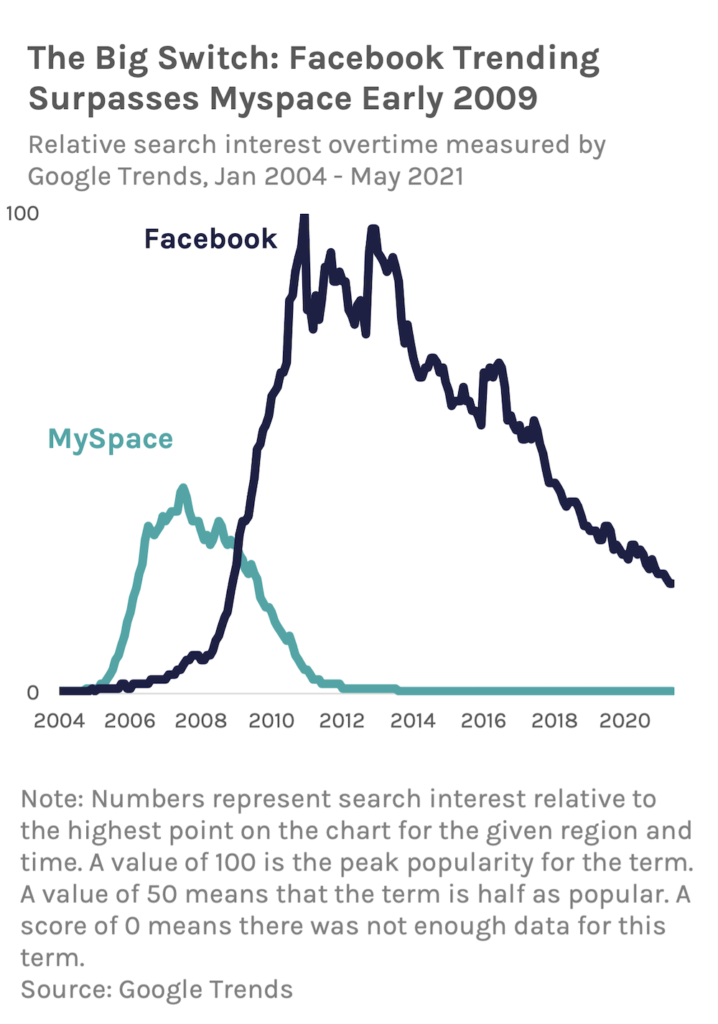
Default charts created by software, like Excel, include a lot of noise. I’m not sure if this is to show all the different style options of the software, but charts created by default usually have a ton of unnecessary design elements.
I highly suggest avoiding these default charts. Instead, ask yourself: what things are helping me tell the story in the data? If you find something that is merely “icing” and isn’t helping tell your story, take it out!
Common noise makers are:
- gridlines
- Chart borders or outlines
- Background shading
- Axis titles
- Different shapes for line chart data points
- Plot area borders or outlines
- Call out boxes
- Legends
- Excessive axis or data labels
|
Before
|
After
|
Apply direct labels
If the goal is telling a clear story with your data, readers need to be able to understand the value of data immediately. The best way to do this is implement direct labels on your chart.
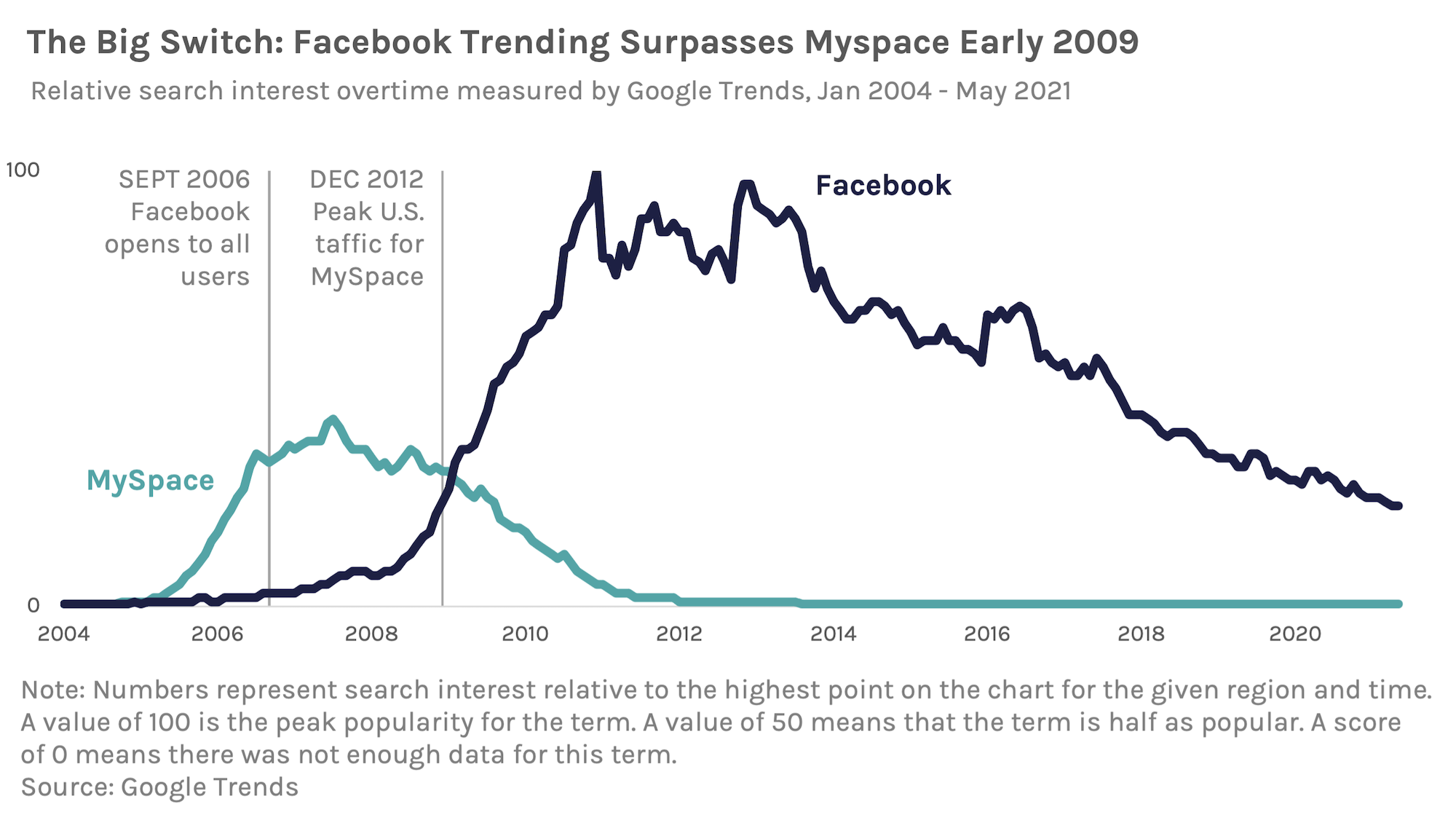
By using direct labels, readers see the values of data points while they are exploring your chart. They don’t have to refer to an axis or table to know the values of the data; it’s all right there.
Direct labels for categories also eliminates the need for a legend. Avoid legends when possible. While there are some good uses for legends (which would justify another blog post!), most of the time they just cause more work for your reader. Instead, directly label your lines, bars, etc. with the category.
Check your axis
Anytime you create a chart using a tool, like Excel, you need to check your axis. Your axis, particularly your y-axis, determines the look and more so, the understanding of your data in the visual space of your chart.
Two important questions to ask yourself are:
- Is my axis working with my trend?
- Does my axis start at zero?
If your axis values are too large, it’s hard to see the changes in the trend. If the values are too small, the changes are exaggerated. If the axis values are in an unusual step or the max value is uneven (like 43 instead of 50), it can make it hard for readers to understand the trend as a whole.
Starting at Zero
For whatever reason, some charting tools like Excel like to truncate chart axis by starting the axis at some other value than 0. Ugh! I can’t even tell you how many times I’ve made a chart, copied it into Word, only to realize Excel changed the axis for a bar chart or whatever to start at like 7 instead of zero.
In almost every case, with few specific exceptions, axes should start at zero. Bar charts ALWAYS start at 0 with no exceptions. NEVER start a bar chart at any value than zero.
For trend charts, the y-axis can start at a value other than zero in some cases. A common usage is for trends with statistically significant fluctuation that is difficult to see on a zero baseline. Here, the change along the trend line is hard to notice when the axis starts at 0.
Chart with a baseline of 0
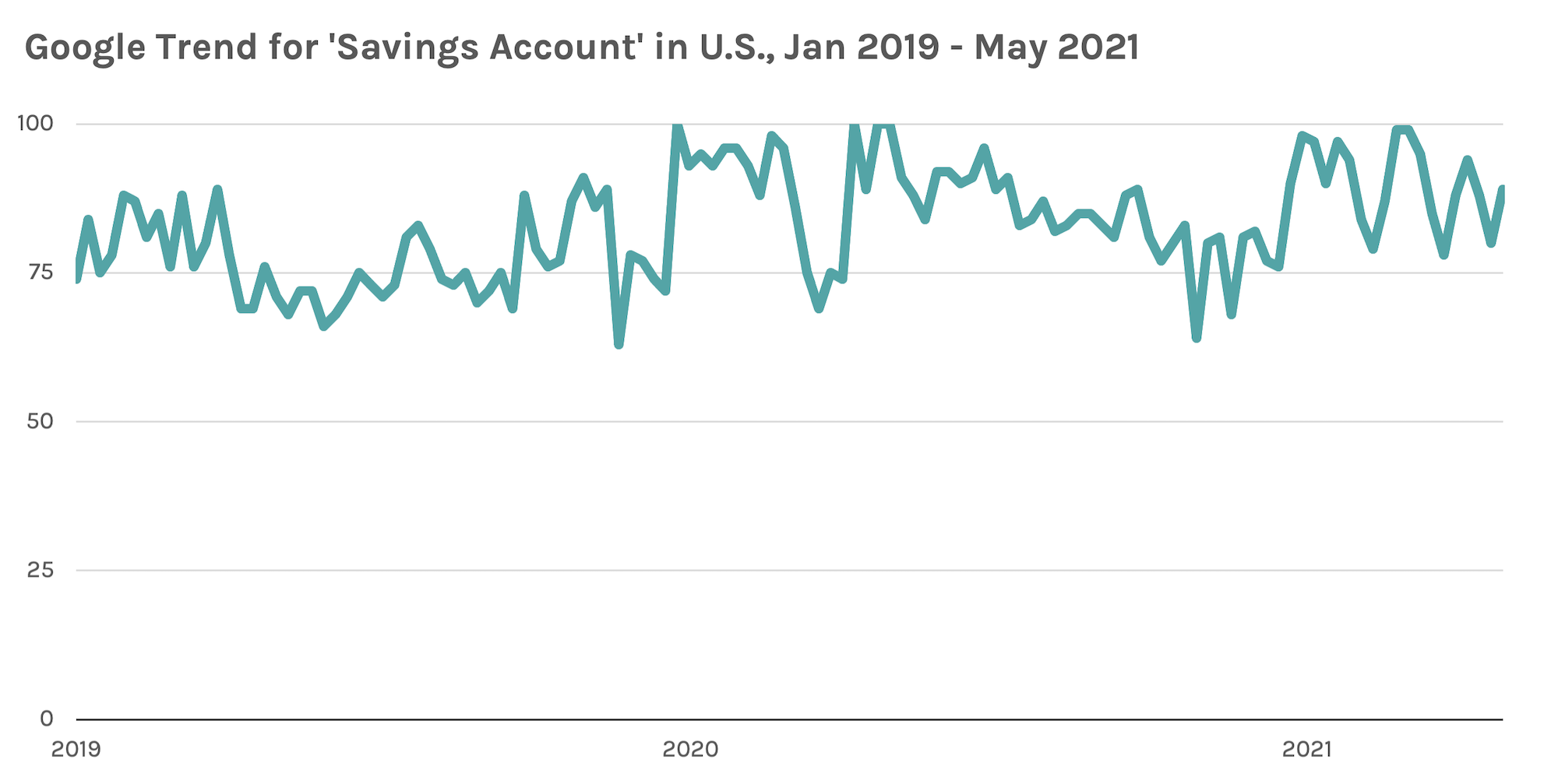
However, this change over time is significant, so plotting the axis at 60 helps to see the subtle change in the trend.
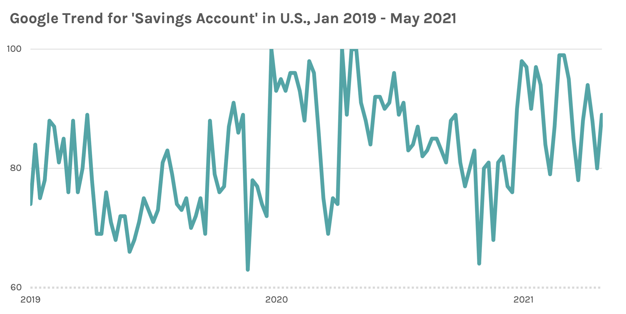
I highly suggest using a different baseline style for charts that start at a different value. I usually use a solid, heavier weight line for zero baselines and a dotted line for baselines that start at another value.
Creating Better Charts
No matter your tool, it’s easy to refine your charts and graphs. By adding titles, annotations, and cleaning up noise, you can tell better stories and increase understanding. Here, we’ve talked about 5 ways to make better charts, but there are even more ways, like using color and adding context. I’ll be putting together another quick guide (with examples!) of even more ways to make your charts better very soon!
In the meantime, what do you think? Did you find these tips helpful? In what ways to do you display data to increase understanding and tell better stories? Let me know in the comments!


