I’ve already talked about my love for sketching and how important it is to my design work,. Don’t think I’ll let you get away without hearing some of it again!
I’m going to credit learning the love of sketching from my art professors in college, because I can’t really remember doing it anytime before then. Before college, I hadn’t really had any art classes, other than elementary/middle school. I have to admit, where more opportunities to listen to the radio and goof around with my friends than really learn anything about the elements of design.
God bless you, Ms. Coleman! You were such a trooper to not strangle us while trying to teach us how paste together construction paper to make Native American portraits (It was the 90s and Indiana). Though I did learn how to draw a braid, trace pictures on a window and draw Jack the Pumpkin King for my Christmas snowglobe project, so it wasn’t a total waste of childhood class time.
In college, I spent a lot of time struggling through art class, painting more so than drawing and printmaking. And I spent a lot of time (though it should have been more!) sketching and sketching.
Though I would be the first to admit they were not very good–I’ve got the horrible sketchbooks at home to prove it–it began to connect all those pathways in my brain that help understand visual manipulation of space.
Sketching was and is the place to make plenty of mistakes, try out all the crazy ideas you yourself aren’t convinced can even become reality when pencil touches paper, and try to interpret all the impulses of design buzzing around your brain.
Designing for Digital: The 2014 Political Polarization Report

About every four or five years, Pew Research Center updates their research on the polarization of American politics, focusing specifically on the beliefs and behaviors of the voters, opposed to Congress. They cover a whole range of topics, issues, engagement behaviors, and attitudes. It’s pretty fascinating stuff!
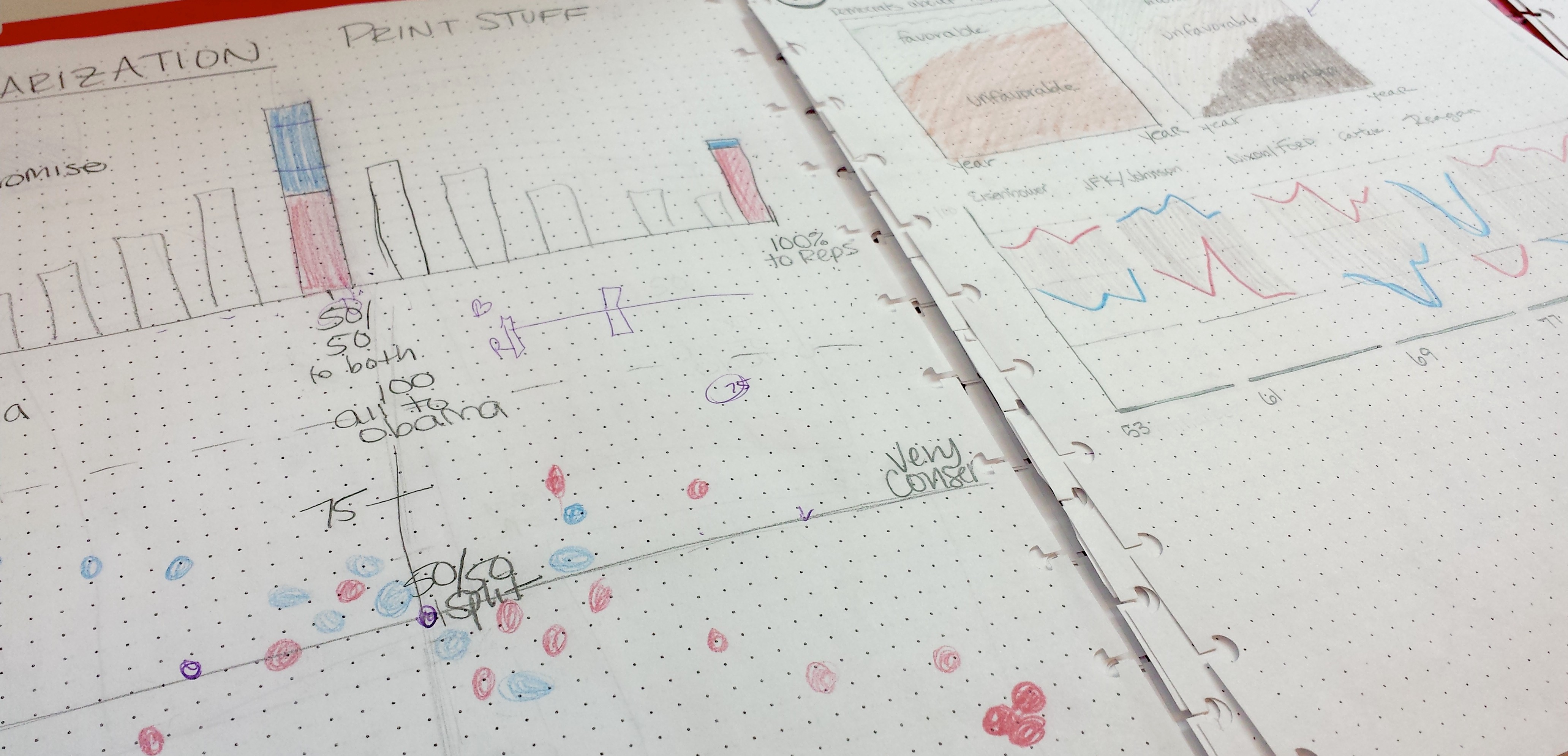
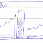
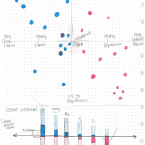
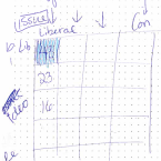
I already covered some of the graphics that I produced for this report, but I thought I’d share some of the sketchwork I created during the creative development process.
Digital First Dissemination
It’s worth mentioning is that this report was new in our production approach in that we were going for a “digital first” mode of publication. Typically, reports from Pew Research are developed using Word and then formatted for web HTML and PDF dissemination.
This report, however, was from the beginning development with that web dissemination in mind:
- How can we structure this report for the best web experience?
- How can the graphics lead the reader through the chapters of the report?
- How can we help readers dive into this data?
Sketching the Graphics
For this particular project, each chapter would open with a graphic that we visually anchor each section while teeing up the reader to what topics were to come.
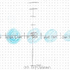
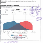
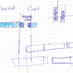
Here are the sketches I created for the researchers at the beginning of our creative development.
These were actually extremely useful, as I was able to draw and explain the concept for our research team at the same time at the beginning, saving a lot of time during the actual production stage later.
I’ve found that sometimes, the best method of communicating your idea for data viz, is just to sit down with the client and talk them through it, explaining your idea while you should them your creative process. It takes a lot of the mystery out of the process and has helped me to build more productive relationships with my clients.


