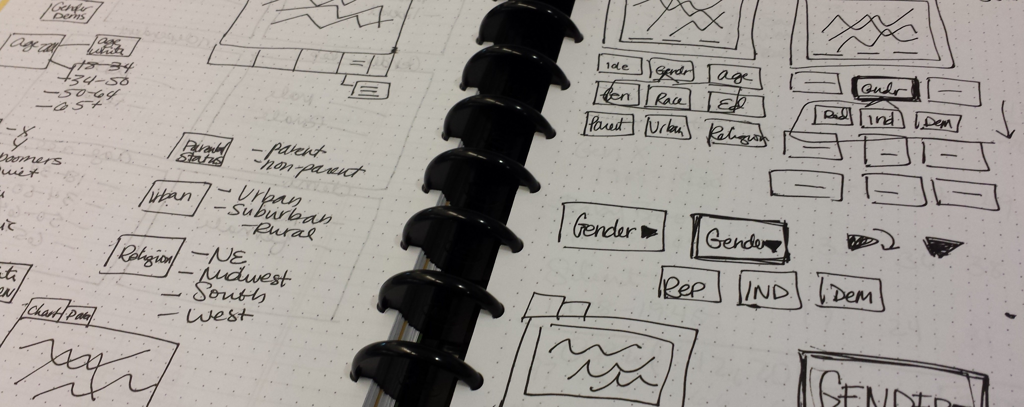
Sketching: though it seems like a dying step in a designer’s workflow, I still can’t start a project without. For almost everything I produce, I sketch some portion of it out, even if it looks like a series of ineligible blocks and lines representing photos, charts, and text. Even after abandoning quite a few ‘art school’ habits (I’m looking at you, gesture drawings and anything to do with painting), I just can’t get away from sketching.
I’ve come to see it like a way for my hands to get on board with whatever is going on in my bean before I actually touch a computer. I get these concepts in my head that I really don’t even know what they look like before they become something real, something on paper, without all the finality that comes with mocking things up electronically. Sketches in Illustrator, for example, are almost too clean; they just look too good, even roughed out. Sketching is the best way to explore, make mistakes, and wrestle with a concept before any restraints on color, font, size, etc are placed on your idea.
Creating the Library User Typology Quiz

This year, Pew Research Center produced a report about the wide range of library users in the United States, based survey responses and behaviors of respondents. In addition to the report, we created an interactive quiz that steps takers through a the same series of questions from the survey.
Working with researchers and web developers, I worked to redesign our quiz result page, a data-rich dashboard to display user data and typology results based on their responses to the online quiz..
As we solved design problems for this particular project, we were also working on the overarching design of these type of data-rich, dashboard type projects, mainly used as quiz results pages. Pew Research Center has previously produced a similar user interface with the 2011 Political Typology quiz. This redesign used this previous product as a foundation to create an UI that could be apply universally at the Center.
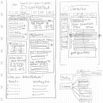
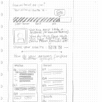
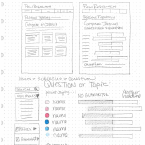
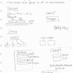
Sketching the New UI

To begin this redesign process, I started with the UI of the 2011 Political Typology Quiz and tried to established a clearer hierarchy, divided a conquer what had become a “wall of numbers” and build in more conversational aspects of the results page, such as a description paragraph and social media share icons.
Color was used as the type identification, while icons would be used to to build in hierarchy within the question database users could explore.
Sketches of the New Quiz UI
Developing the Typology Group Icons
The Library User Quiz also featured icons representing each typology group. These group names were developed for the report and implemented here as well to classify quiz takers.

The final icons were used on the result data dashboard and also used when sharing results via social media.
The Importance of Sketching: What do you think?
Do you sketch out design work on pen and paper? Is it a dying skill that’s been replaced by prototyping, iPad gesture sketching apps, and the ease of rapid development in programs like Adobe Illustrator?
I’d like to know what you think about sketching for design/web work!



2 Comments