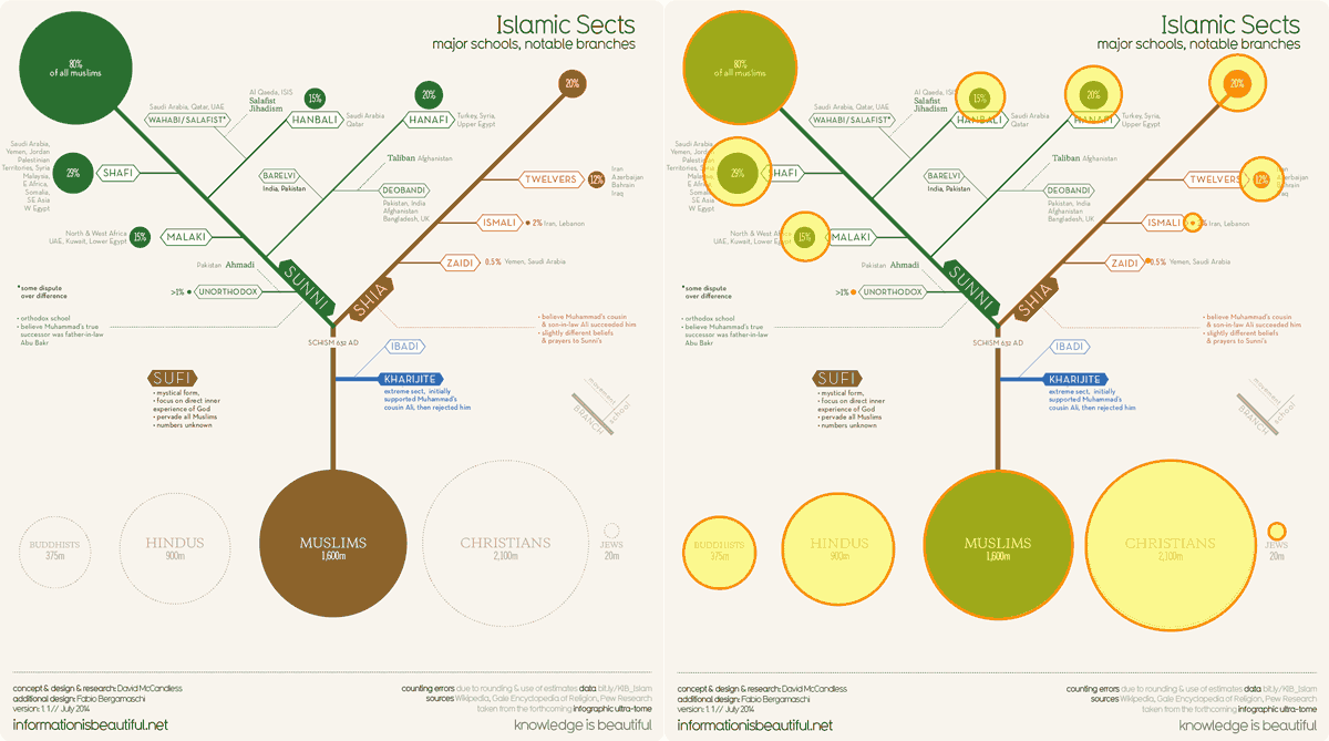
Information is Beautiful just published a great chart about the different sects, schools, and branches of Islam. It makes a lot of really complicated information very clear. However, it’s fallen prey to some sometimes hard to calculate proportional bubble mistakes. I’ve overlaid the corrected bubbles over the original:

The population bubbles are correct and in proportion to each other, but the breakdowns of the sects at the top for the smaller percentages are off. You can see the full size version at Information is Beautiful.


